 admin
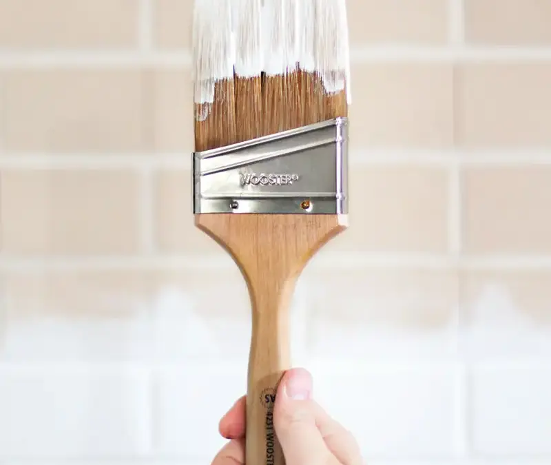

Choosing white paint can feel like an easy shortcut until you see how many shades are available. Some whites look warm, cool, bright, or muted depending on the room, so the color on a small paint card may not match the effect on your walls. Testing samples in your own space can help you avoid an unwanted repaint and make a more confident choice.
Before choosing a shade, consider the amount of natural light, your home’s style, the colors and materials already in the room, and the direction your windows face. These factors can change how white appears throughout the day.
A practical first step is to buy sample paint and apply it to a large area of the wall. A broad sample is easier to judge than a small swatch, especially when viewed beside your flooring, curtains, furniture, and trim. Check it at different times of day and with the room’s usual lights turned on.
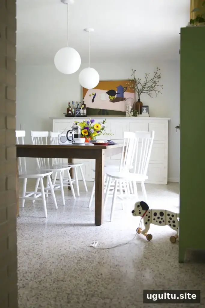
White walls help brighten a formerly dim dining room. / photo by Mandi Johnson for Mandi’s Dining Room Before & After
Choosing white paint based on your room’s brightness
A bright white can help a dim room feel fresher, but the result depends on how much light the space receives and what surrounds it. In a dining room with a large sliding patio door, even light, and yellow curtains, a light, neutral white can create a brighter backdrop. Beside untinted white trim, cabinets, and chairs, however, that wall color may look less bright than expected.
Rooms with more windows or a skylight may make a very bright white feel especially intense. In a small room with limited daylight, a softer light neutral or a more saturated color may feel more comfortable than stark white. Test the color in the darkest and brightest parts of the room before settling on it.
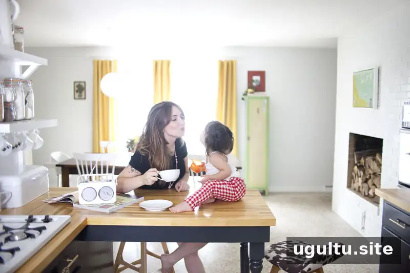
White walls create a soft background for limited color in the dining area, while contrasting cabinetry makes a bold statement in the bright white kitchen. / photo by Mandi Johnson from Kitchen Renovation Reveal
The effect of white paint depends on the whole space. A room with open sightlines, natural light, and moderate contrast may respond differently from one with dark floors and little daylight. Use a large sample to see whether the shade still feels right in the parts of the room that receive less light.
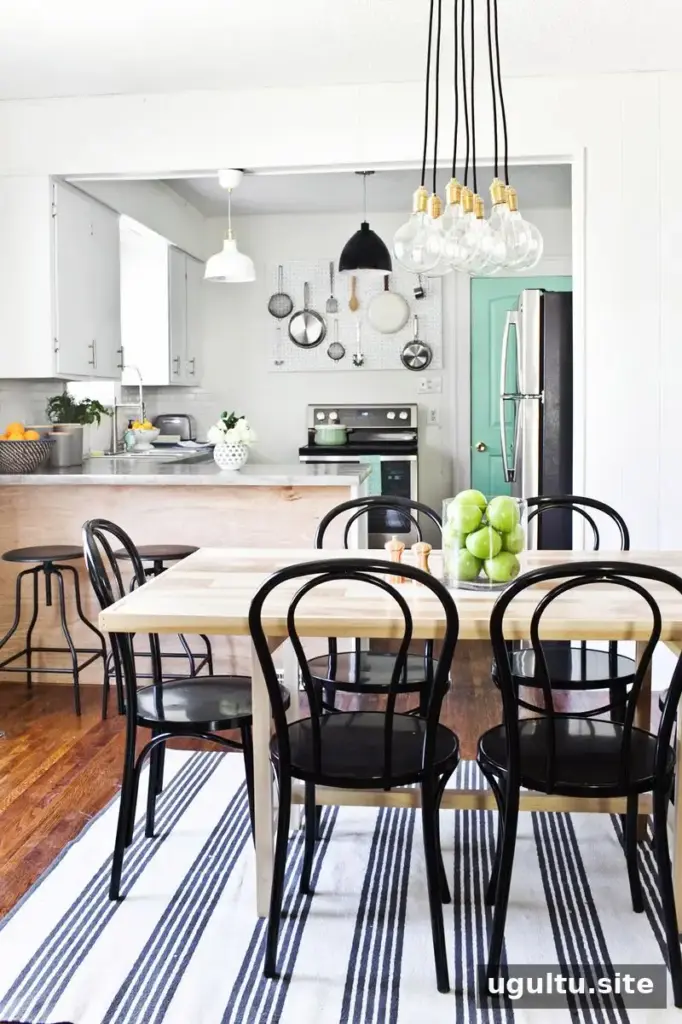
Black details stand out against white, while neutrals and natural wood create a Scandinavian-inspired mix. / image by Janae Hardy for HFHS Dining Room Before and After
Match the white to your home’s style
White can suit many interior styles, but the contrast and colors around it help determine the overall mood. Pairing white walls with dark furniture or black details creates a bold, modern look. A softer palette with similar tones can feel more gentle and romantic. White can also work in a bohemian room, particularly when combined with other styles and natural materials.
The undertone matters, too. A yellow-tinted white can feel traditional or vintage-inspired, while a cooler, blue-gray white may read as more contemporary. Decide whether you want a strong contrast or a quieter backdrop, then compare samples with the furniture and finishes that will stay in the room.
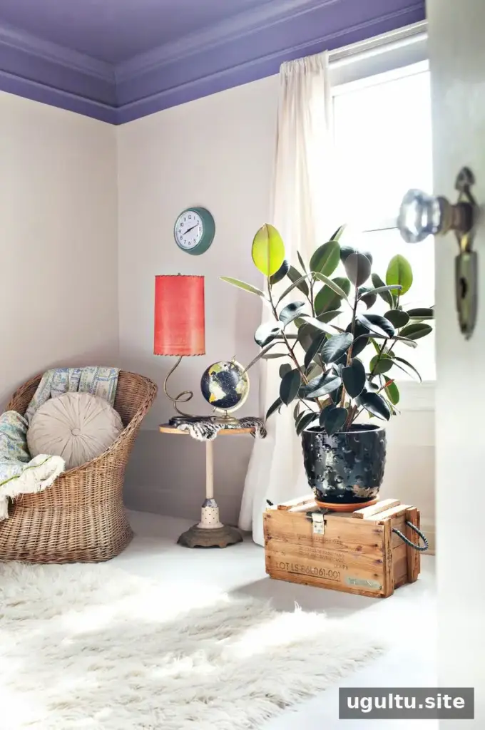
A light taupe looks nearly white beside a bold purple ceiling, creating a subtle contrast for a relaxed, bohemian space. / photo by Janae Hardy for At Home With Janae Hardy
Consider nearby colors and materials
Surrounding colors can change how a white wall appears. A neutral shade may seem cooler beside warm colors, while dark furnishings can make a white wall look much brighter by contrast. Look at the full range of nearby elements, including curtains, flooring, large furniture, paneling, molding, and accent walls.
For example, yellow curtains may make a cool white feel more noticeable by comparison. A colored wall can also reflect light onto an adjacent white wall and subtly shift its appearance. Check your sample next to the colors that will remain in the room rather than judging it on its own.

The same neutral gray can appear different when surrounded by contrasting colors. A color’s perceived brightness also changes with its surroundings. / image via Josef Albers’ Interaction of Color
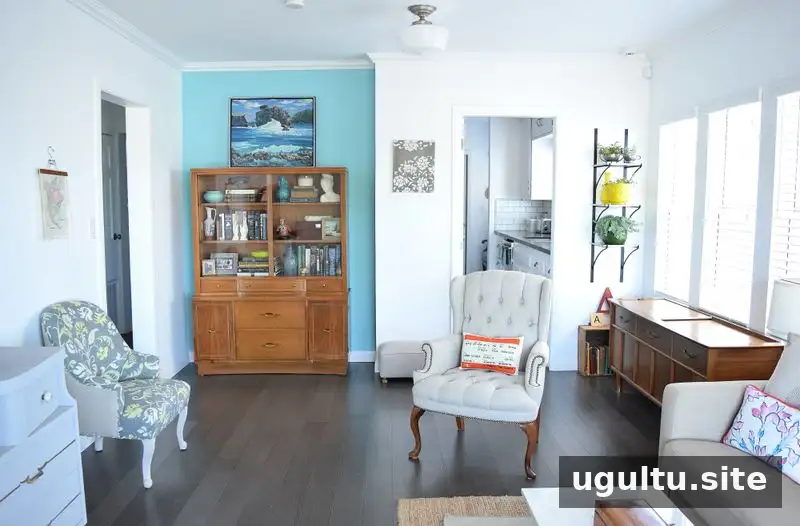
Reflected light from a blue accent wall, and possibly the northern exposure, can make these white walls appear cool. / image by Katie Costik from At Home With Katie Costik in Los Angeles, California
White walls can make colorful accessories stand out. If the contrast feels too strong, natural wood or other muted materials can help balance the room. In the example below, darker wall paneling anchors colorful objects and softens the overall effect.

Dark paneling along the lower wall anchors the colorful accessories in this space. / photo by Kelly and John Ginn for At Home With Kelly Ginn in Memphis, Tennessee
Account for window direction and artificial lighting
Both daylight and light bulbs affect how white paint looks. Artificial lighting can shift a wall’s appearance: fluorescent lighting may make it seem bluer or greener, while incandescent lighting can bring out red or yellow tones. Bulbs come in different color temperatures, so check your paint sample under the lighting you normally use in the room.
Natural light also changes with the direction of the windows. East-facing rooms receive warm, yellowish light in the morning and cooler indirect light later. West-facing rooms tend to be dimmer in the morning and receive warmer, reddish light in the evening. In the Northern Hemisphere, south-facing windows generally receive more daylight, while north-facing windows typically provide cooler, more consistent indirect light.
These are useful tendencies, not a substitute for testing: trees, roof overhangs, nearby buildings, and the time of day can all affect the light in a particular room. If a north-facing room looks too cool, compare warmer whites. In a west-facing room with warm afternoon light, a cooler sample may create a more balanced effect.
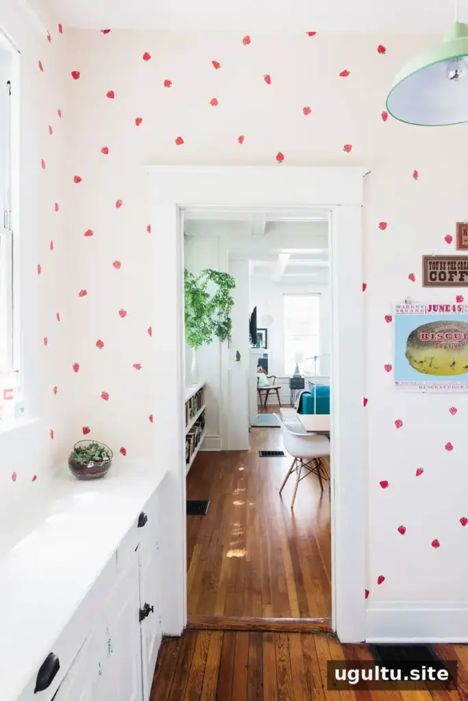
A white with a slight pink tint may look especially pink in a west-facing room and more lavender in a north-facing room. In a south-facing room, it may appear closer to its underlying color, though its look can still change during the day. / image by Morgan Trinker for At Home With Morgan Trinker in Birmingham, Alabama
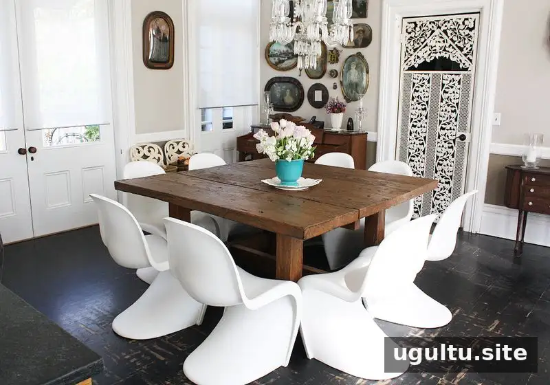
Different shades of taupe and pure white create a calm, eclectic bohemian space. / image via Suna Lock from At Home With Suna Lock
Test samples before choosing white paint
A white that looks appealing in another home may appear quite different on your walls because each room has its own light, colors, and materials. Narrow down your options, paint a generous sample area, and view it at different times of day beside the features that will remain in the space.
Choosing white paint is easier when you judge the shade in context rather than relying on a paint card alone. Consider brightness, style, surrounding colors, and window direction, then give the sample time to show how it behaves. A careful test can help you find a white that feels right in your home.